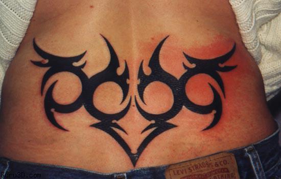
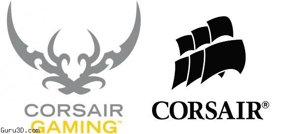
Okay honesty, I didn't even see this one myself until you really start to really change your mind-set and look at it ? Last week Corsair gaming launched and ever since that moment apparently some end-users are a bit upset about that, the new logo looks like a tramp stamp aka tribal tattoo on the lower back of (preferably) a girl. Now if you look closely its just two pirate swords really, but sure it can also be interpreted as a tramp stamp.
Corsair explains they are amazed to see the passion customers have for the the sails logo and promises they will continue to use it on all Corsair PC component products. However, the new logo will be continued as well. And quite honestly, I don't see a reason not to as this is SOOO blown out of proportion.
Corsair posted a short statement on this on their facebook account:
We hear You.
As many of you know we launched our new Corsair Gaming line of peripherals this week. We’ve received a ton of feedback on the products and new logo. We are amazed and humbled by the passion our customers have for the original Corsair sails logo. The ship + sails are here to stay and will continue to be used on all Corsair PC component products.
However, we know many of you prefer the classic logo on our keyboards, and you’ve made your voices heard. For those of you looking for the new K70 RGB with the original sails logo, it’s currently available in North America from Newegg – just look for the SKU CH-9000063-NA. What’s more, as a direct result of your feedback, we will continue to sell and manufacture the Vengeance K70 and Vengeance K70 RGB with Cherry MX Red switches, with the sails logo, via select retailers and Corsair.com.
Let’s keep talking!
Can we just call the logo for what it really is ? Yep, two swords or daggers. There's never a dull moment in the PC Gaming hardware industry, HARRR :)


